Purchasing prints is often an easier way to buy into an artist’s work when painting prices stretch the pocketbook. Furthermore, there are many artists who are specialist printmakers who may not work in other media. This collection of prints by 12 artists has elements of both, while also illustrating a range of printmaking techniques – etching/aquatint, screenprint, mokuhunga and inkjet. There is much to savour here.
I have eclectic tastes and the 12 featured artists illustrate this well! Besides the variety of subjects it is the quality of their execution and the fine use of the chosen medium which attracts my eye. These prints have all been made by printmakers who know their craft and how to get the best out of it.
On the whole, the prints speak for themselves. Nonetheless, I can offer some observations:
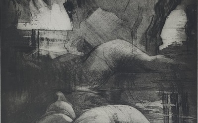
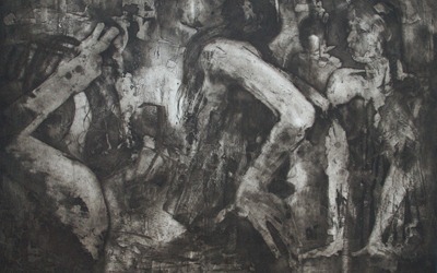
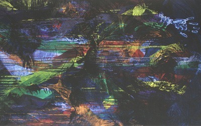
CRAWFURD ADAMSON (1953-2024) was an Edinburgh born artist who studied art at Duncan of Jordanstone College of Art in Dundee. The principal focus of his work was the human figure, set individually or in groups in pub/club style interiors. Never straightforward in approach, he presented his figures from less obvious perspectives, combined with rich colour, which was often abstract in manner. Adamson was a fine draughtsman and etcher, the three prints here providing a strong impression of his subject and style.
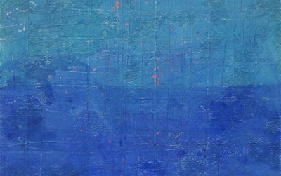
BRONWEN BRADSHAW is a prominent figure in the world of Somerset’s printmaking, as not only a successful artist but as owner of Dove Studios, an organisation that combines teaching and practice to both amateur and professional participants. She experiments a great deal in her etching, complimented by her affinity for abstract design, in line and in use of colour. They are printed in small editions or are, as in the case of Remembering Blue IV, unique. Remembering Blue IV is particularly remarkable for its scoring and rich blues that are offset by flashes of vermillion.
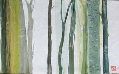
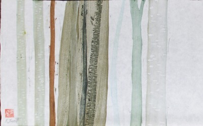
ROBIN FROOD has made mokuhunga her specialty. A Japanese technique which involves cutting into woodblocks and printing on to rice paper, Frood excels in the subtleties of the medium. This pair of unique Forest prints are excellent examples in which the balance of colour and tone, and forms, creates a rhythm across the sheet, giving the allusion of visual depth to the design. Frood gives courses in mokuhunga for those seeking new adventures in printmaking.
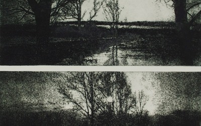
JENNY GRAHAM – Although born in England Jenny Graham spent much of her formative years in the US. She first studied art at the Cooper Union Art School in New York City before returning to the UK. She has been based in Somerset for the past three decades. A versatile and imaginative artist she has experimented extensively with photo-etching, among other print techniques. Aller Moor on the Somerset Levels is a double-plated print in which she gives the illusion of the sky in the lower half feeling as if it’s a continuation of the foreground pond in the top. It’s not a mirror image or a reflection. One of the things I admire about this print is that it challenges the way landscape can be re-imagined.
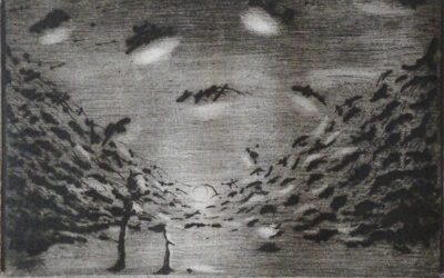
LINO MANNOCCI (1945-2021) – I first met Mannocci when he was represented in London by Art First, where I was co-director. Dusk is an imaginary landscape with a dreamlike quality. Clouds, a favourite and well studied subject of his, catch the rays of the setting sun which is disappearing at the end of a valley. The organisation of the sun’s reflection in the clouds creates a circular motion that takes the eye up either side of the valley and leads, via the angle of light, to its opposite side. A sole standing figure observes. It is possibly inspired by the landscape seen from his studio in Montigiano in Italy, where he would visit annually (he was born in Viareggio and moved to London in 1968 which became his primary residence).
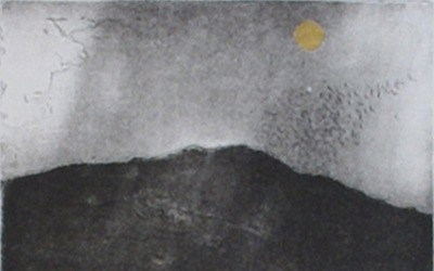
SHEILA ONLINER (1930 – 2020) was born in London. She moved to Cornwall in 1985, opening a studio in St Ives. In London, she had trained at Slade School of Fine Art in 1945, and then City and Guilds. In the 1970’s she worked at Studio Prints, where she learnt print making from Dorothea Wight. She was an active participant in the St Ives printmaking scene. Zennor Night is an aquatint inspired by the village where she lived, the moon formed by a burnished piece of gold leaf. It is a contemplative image, its zen quality one of the reasons why her work was particularly well-admired in Japan. Like Mannocci’s print, it is very much a landscape of the mind.
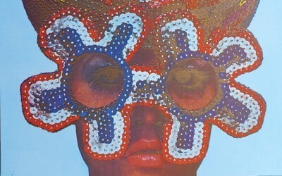
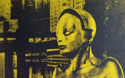
SIR EDUARDO PAOLOZZI (1924-2005) was one of the UK’s greatest artists with a considerable reputation as a sculptor. He was also highly regarded for his prints. He was a co-founder of the Independent Group and a key innovator in the Pop Art movement. His earliest prints broke with convention both in the way they were structured through a collage of images but in combining techniques such as screenprint and photo-lithography. His unique vision and explorations of man, machine and the everyday object provide a kaleidoscopic view of a world which is recognisable but simultaneously alien. This is particularly true of the prints that make up General Dynamic F.U.N., a portfolio of fifty photolithographs and screenprints published by Editions Alecto in 1970, a selection of which is offered here.
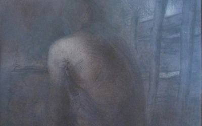
RICHARD POMEROY’s Tor from Wearyall Hill explores the myth that Joseph of Arimathea is buried beneath Glastonbury Tor. The figure is subsumed into its surroundings, an echo of the body paintings that Pomeroy had done in earlier years. I do not usually consider buying inkjet prints unless conceived and executed on computer, which this has been. Pomeroy is not a printmaker in any conventional sense but the concept, complexity and richness of the image was hard to resist.
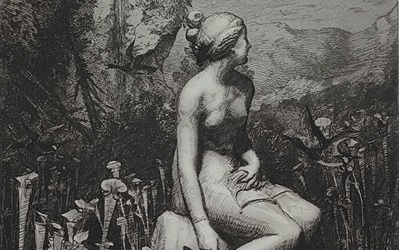
CHRIS ROANTREE is a London based printmaker who trained at the Royal College of Art. He is an award winning, multi disciplinary, London based artist practicing in traditional etching and developing the intaglio print tradition. I was not looking for contemporary prints that echo those of the Old Masters. Nonetheless, I find his Hunter’s Moon has a striking parallel in the Swiss artist Salomon Gessner’s Leda (1770). My view was that although coincidental, Roantree’s print was an unconscious re-imagining of a C18 Romantic idyll. (You can see Gessner’s Leda in this article.). Roantree is a very fine etcher, as this print illustrates.
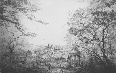
SEOW WAI is a London based artist. His view of a distant city in A Mellow Hillside employs a long-time tradition of framing the scene with trees and a foreground that drops away before the viewer (both inside and from outside of the print!). A small rotonda monument anchors the foreground. His trees are done with a mix of line etching and tonal aquatint which become fainter as they recede. The city, caught in slanting light, is dominated by a cathedral, the lines of the spires of other churches leading the eye towards it. In its construction, Wai’s image contains elements of a much older tradition in landscape art.
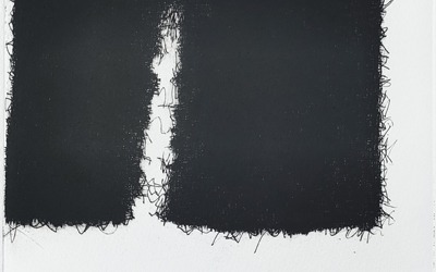
JACY WALL is a Dorset resident who first trained in constructed textiles. Her tapestries celebrate textile patterns and textures, while also incorporating patches and stitching through an ongoing project about mending and repair. Etching is a parallel activity, which gives her the opportunity to explore themes and motifs more broadly. Being able to combine and alter printmaking plates helped free up her approach to weaving, even taking scissors to a tapestry in order to change it. Split is part of this investigation. The deep black form with its frayed edges is silhouetted against the whiteness of the paper.
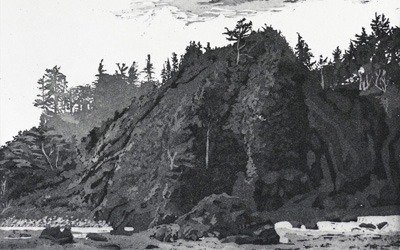
LUCY WARD is also London based, whose themes are landscape and nature. Her foreshore view Towards the Forest is a bold statement with the cliff dominating the image. It stands proudly on the foreshore trees and mist behind. It has an mysterious atmosphere which is built up by the variety of shades of grey and dark tones that contrast the misty air to its left. Her use of aquatint gives depth to the building of tones across the image.
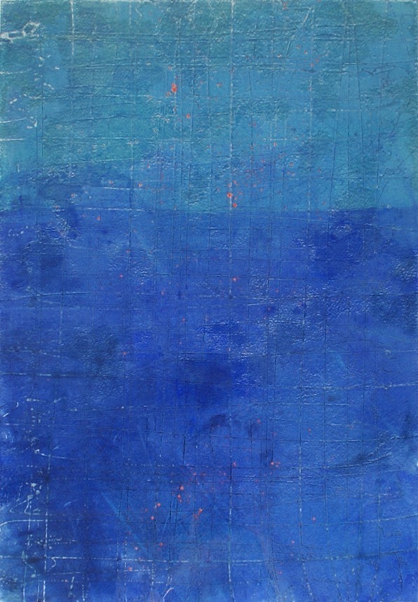
Remembering Blue IV: Indigo, Oriental Blue, Evedano & Vermillion